Flutter Card
A card is a Paper representing the information related to each other, examples are album, a geographical location, contact details, etc. A card is a box which has a shadow and rounded corners. We use it to show the content and actions pushed in a single object. In this Section, we are going to learn how to use and customize a card widget.
Card is very simple to use. card constructor is used and then passed a widget as a child property to display the content and actions inside the object. This is a code simple for card:
return Card(
    child: Column(
      mainAxisSize: MainAxisSize.min,
      children: [
        const ListTile(
          leading: Icon(Icons.album, size: 45),
          title: Text('Sonu Nigam'),
          subtitle: Text('Best of Sonu Nigam Song'),
        ),
      ],
    ),
);
Flutter Card Properties
Card Widget can be customized using the following properties. Some of the properties are:
| Attribute Name | Descriptions |
|---|---|
| borderOnForeground | Paints the border of the front of a child. By default, it’s true. |
| color | Changes color the card’s background. |
| elevation | Used to increase or decrease the shadow size below the card.. |
| margin | Used to add the card’s outer space. |
| shape | Used to customize the shape of the card. |
| shadowColor | Used to change the color of the shadow of a card. |
| clipBehavior | Used to clip the content of the card. |
Lets customize the card’s size, we have to wrap the card in a Container or SizedBox widget. Here, we can set the card’s height and width using the container or sizedbox property:
Container(
    width: 150,
    height: 150,
    child: Card(
       ...
    ),
  )
Example:
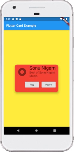
In this example, we will be using a card widget that will show the album information and two actions buttons Play and Pause.
import 'package:flutter/material.dart';

void main() => runApp(MyApp());

/// This Widget is the main application widget.
class MyApp extends StatelessWidget {
  @override
  Widget build(BuildContext context) {
    return MaterialApp(
      home: Scaffold(
        appBar: AppBar(title: Text('Flutter Card Example')),
        backgroundColor: Colors.yellow,
        body: MyCardWidget(),
      ),
    );
  }
}

/// This is the stateless widget.
class MyCardWidget extends StatelessWidget {
  MyCardWidget({Key key}) : super(key: key);

  @override
  Widget build(BuildContext context) {
    return Center(
      child: Container(
        width: 300,
        height: 200,
        padding: new EdgeInsets.all(10.0),
        child: Card(
          shape: RoundedRectangleBorder(
            borderRadius: BorderRadius.circular(15.0),
          ),
          color: Colors.red,
          elevation: 10,
          child: Column(
            mainAxisSize: MainAxisSize.min,
            children: [
              const ListTile(
                leading: Icon(Icons.album, size: 60),
                title: Text(
                  'Sonu Nigam',
                  style: TextStyle(fontSize: 30.0)
                ),
                subtitle: Text(
                  'Best of Sonu Nigam Music.',
                  style: TextStyle(fontSize: 18.0)
                ),
              ),
              ButtonBar(
                children: [
                  RaisedButton(
                    child: const Text('Play'),
                    onPressed: () {/* ... */},
                  ),
                  RaisedButton(
                    child: const Text('Pause'),
                    onPressed: () {/* ... */},
                  ),
                ],
              ),
            ],
          ),
        ),
      )
    );
  }
}
Output