Flutter Drawer
Material Design has two primary options for navigation which are Tabs and Drawers. A drawer is an alternative for tabs because we don’t have sufficient space in the devices.
Let’s learn how the drawer works. Drawer widget is a sliding left menu layout with a Material Design widget.
Let us see example code:
Tabs are common in Android and iOS apps which follow the Material Design guidelines. Flutter provides an easy way to add a tab layout. We use a TabBar and TabBarView with a TabController to add tabs. The controller is used to sync between both.
Lets see an example to explore tabs
import 'package:flutter/material.dart';
void main() => runApp(MyApp());
class MyApp extends StatelessWidget {
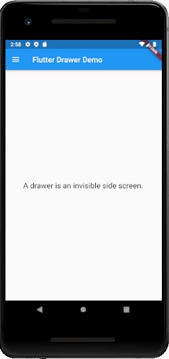
final appTitle = 'Flutter Drawer Demo';
@override
Widget build(BuildContext context) {
return MaterialApp(
title: appTitle,
home: MyHomePage(title: appTitle),
);
}
}
class MyHomePage extends StatelessWidget {
final String title;
MyHomePage({Key key, this.title}) : super(key: key);
@override
Widget build(BuildContext context) {
return Scaffold(
appBar: AppBar(title: Text(title)),
body: Center(child: Text(
'A drawer is an invisible part on the side.',
style: TextStyle(fontSize: 20.0),
)
),
drawer: Drawer(
child: ListView(
// Remove any padding from the ListView using EdgeInsets.zero.
padding: EdgeInsets.zero,
children: [
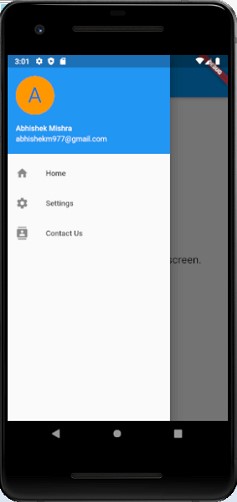
UserAccountsDrawerHeader(
accountName: Text("Abhishek Mishra"),
accountEmail: Text("abhishekm977@gmail.com"),
currentAccountPicture: CircleAvatar(
backgroundColor: Colors.orange,
child: Text(
"A",
style: TextStyle(fontSize: 40.0),
),
),
),
ListTile(
leading: Icon(Icons.home), title: Text("Home"),
onTap: () {
Navigator.pop(context);
},
),
ListTile(
leading: Icon(Icons.settings), title: Text("Settings"),
onTap: () {
Navigator.pop(context);
},
),
ListTile(
leading: Icon(Icons.contacts), title: Text("Contact Us"),
onTap: () {
Navigator.pop(context);
},
),
],
),
),
);
}
}
Output
When you click on the burger icon top left screen, you can see the drawer sliding left.