Flutter Switch
A switch is a two-state UI element and is used to toggle between ON (Checked) or OFF (Unchecked) states it is similar to checkbox. It is a button with a thumb slider used to drag back and forth in the form as ON or OFF. This is similar to electrical switches.
Properties of Switch Widget
| Attributes | Descriptions |
|---|---|
| onChanged | This is called when the user tap on the switch. |
| value | Boolean value true or false is set to show the state of the switch. |
| activeColor | specifies the color of the switch round ball when it’s active or on state. |
| activeTrackColor | specifies the color of the switch track bar when it’s active or on state. |
| inactiveThubmColor | specifies the color of the switch round ball when it’s inactive or in off state |
| inactiveTrackColor | specifies the color of the switch track bar when it’s inactive or in off state |
Example
import 'package:flutter/material.dart';
void main() => runApp(MyApp());
class MyApp extends StatelessWidget {
@override
Widget build(BuildContext context) {
return MaterialApp(
home: Scaffold(
appBar: AppBar(
backgroundColor: Colors.blue,
title: Text("Flutter Switch Example"),
),
body: Center(
child: SwitchScreen()
),
)
);
}
}
class SwitchScreen extends StatefulWidget {
@override
SwitchClass createState() => new SwitchClass();
}
class SwitchClass extends State {
bool isSwitched = false;
var textValue = 'Switch is OFF';
void toggleSwitch(bool value) {
if(isSwitched == false)
{
setState(() {
isSwitched = true;
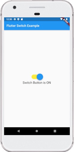
textValue = 'Switch Button is ON';
});
print('Switch Button is ON');
}
else
{
setState(() {
isSwitched = false;
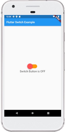
textValue = 'Switch Button is OFF';
});
print('Switch Button is OFF');
}
}
@override
Widget build(BuildContext context) {
return Column(
mainAxisAlignment: MainAxisAlignment.center,
children:[ Transform.scale(
scale: 2,
child: Switch(
onChanged: toggleSwitch,
value: isSwitched,
activeColor: Colors.blue,
activeTrackColor: Colors.yellow,
inactiveThumbColor: Colors.redAccent,
inactiveTrackColor: Colors.orange,
)
),
Text('$textValue', style: TextStyle(fontSize: 20),)
]);
}
}
Output