
Flutter TextField
A TextField Widget is the input widget which holds the alphanumeric data, such as name, password, address, etc. This is a GUI control element that enables us to get text information from the user using a programmable code. We can get a single-line or multiple-line text from the user.
TextField Widget is used as the text input widget that allows us to collect inputs from the keyboard into an app. TextField widget is used in building forms, sending messages, creating search experiences, and many more. By default, it is decorated with an underline. We can add several attributes to it, such as label, icon, inline hint text, and error text using an InputDecoration property. If we want to remove the decoration properties entirely, it is required to set the decoration to null.
This code explains the demo example of TextFiled widget :
TextField (
  decoration: InputDecoration(
    border: InputBorder.none,
    labelText: 'Enter Name',
    hintText: 'Enter Your Name'
  ),
);
Some of the most used attribute are as follows:
- decoration: This is to show the decoration around TextField.
- border: This is to create a default rounded rectangle border around TextField.
- labelText: This is to show the label text on the selection of TextField.
- hintText: this is to show the hint text inside TextField.
- icon: This is to add icons directly to the TextField.
import 'package:flutter/material.dart';

void main() {
  runApp(MaterialApp( home: MyApp(),));
}

class MyApp extends StatefulWidget {
  @override
  _State createState() => _State();
}

class _State extends State {
  @override
  Widget build(BuildContext context) {
    return Scaffold(
        appBar: AppBar(
          title: Text('Flutter TextField Example'),
        ),
        body: Padding(
            padding: EdgeInsets.all(15),
            child: Column(
              children: [
                Padding(
                  padding: EdgeInsets.all(15),
                  child: TextField(
                    decoration: InputDecoration(
                      border: OutlineInputBorder(),
                      labelText: 'User Name',
                      hintText: 'Enter Your Name',
                    ),
                  ),
                ),
                Padding(
                  padding: EdgeInsets.all(15),
                  child: TextField(
                    obscureText: true,
                    decoration: InputDecoration(
                      border: OutlineInputBorder(),
                      labelText: 'Password',
                      hintText: 'Enter Password',
                    ),
                  ),
                ),
                RaisedButton(
                  textColor: Colors.white,
                  color: Colors.blue,
                  child: Text('Sign In'),
                  onPressed: (){},
                )
              ],
            )
        )
    );
  }
}
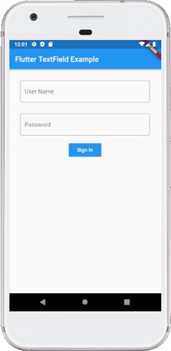
Output:
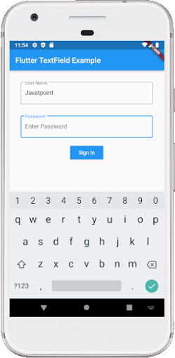
On clicking the TextField we can see that a keyboard has appeared from the bottom of the screen:
How to retrieve the value of a TextField?
We can retrieve the text in mainly two ways: using the onChanged method, and using the TextEditingController. Both are discussed below:
1. onChanged: This method is used to store the current value in a simple variable and then change it in the TextField widget:
String value = "";
TextField(
  onChanged: (text) {
    value = text;
  },
)
2. Controller method: It is a popular method to retrieve text field value using TextEditingController. It will be attached to the TextField widget and then listen to change and control the widget’s text value. Below is the sample code:
TextEditingController mycontroller = TextEditingController();
TextField(
  controller: mycontroller,
)
Lets see an example to check how it is used
import 'package:flutter/material.dart';

void main() {
  runApp(MaterialApp( home: MyApp(),));
}

class MyApp extends StatefulWidget {
  @override
  _State createState() => _State();
}

class _State extends State {
  TextEditingController nameController = TextEditingController();
  TextEditingController passwordController = TextEditingController();
  @override
  Widget build(BuildContext context) {
    return Scaffold(
        appBar: AppBar(
          title: Text('Flutter TextField Example'),
        ),
        body: Padding(
            padding: EdgeInsets.all(15),
            child: Column(
              children: [
                Padding(
                  padding: EdgeInsets.all(15),
                  child: TextField(
                    controller: nameController,
                    decoration: InputDecoration(
                      border: OutlineInputBorder(),
                      labelText: 'User Name',
                      hintText: 'Enter Your Name',
                    ),
                  ),
                ),
                Padding(
                  padding: EdgeInsets.all(15),
                  child: TextField(
                    controller: passwordController,
                    obscureText: true,
                    decoration: InputDecoration(
                      border: OutlineInputBorder(),
                      labelText: 'Password',
                      hintText: 'Enter Password',
                    ),
                  ),
                ),
                RaisedButton(
                  textColor: Colors.white,
                  color: Colors.blue,
                  child: Text('Sign In'),
                  onPressed: (){
                    return showDialog(
                      context: context,
                      builder: (context) {
                        return AlertDialog(
                          title: Text("Alert Message"),
                          // Retrieve the text which the user has entered by
                          // using the TextEditingController.
                          content: Text(nameController.text),
                          actions: [
                            new FlatButton(
                              child: new Text('OK'),
                              onPressed: () {
                                Navigator.of(context).pop();
                              },
                            )
                          ],
                        );
                      },
                    );
                  },
                )
              ],
            )
        )
    );
  }
}
Output
When we run the application in android emulator, we should get UI similar to the following screenshot:
